PV Yugaherb Organics LLP

No logo, no packaging, no website. Just an idea. We turned it into a living Ayurvedic brand people can see, hold, and trust.

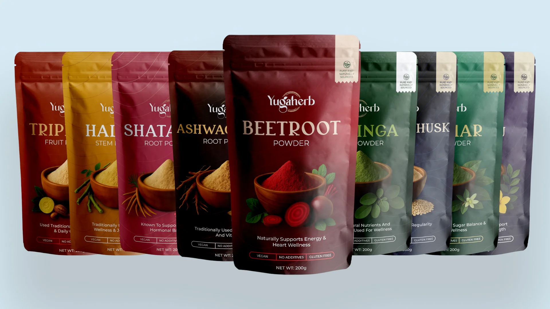
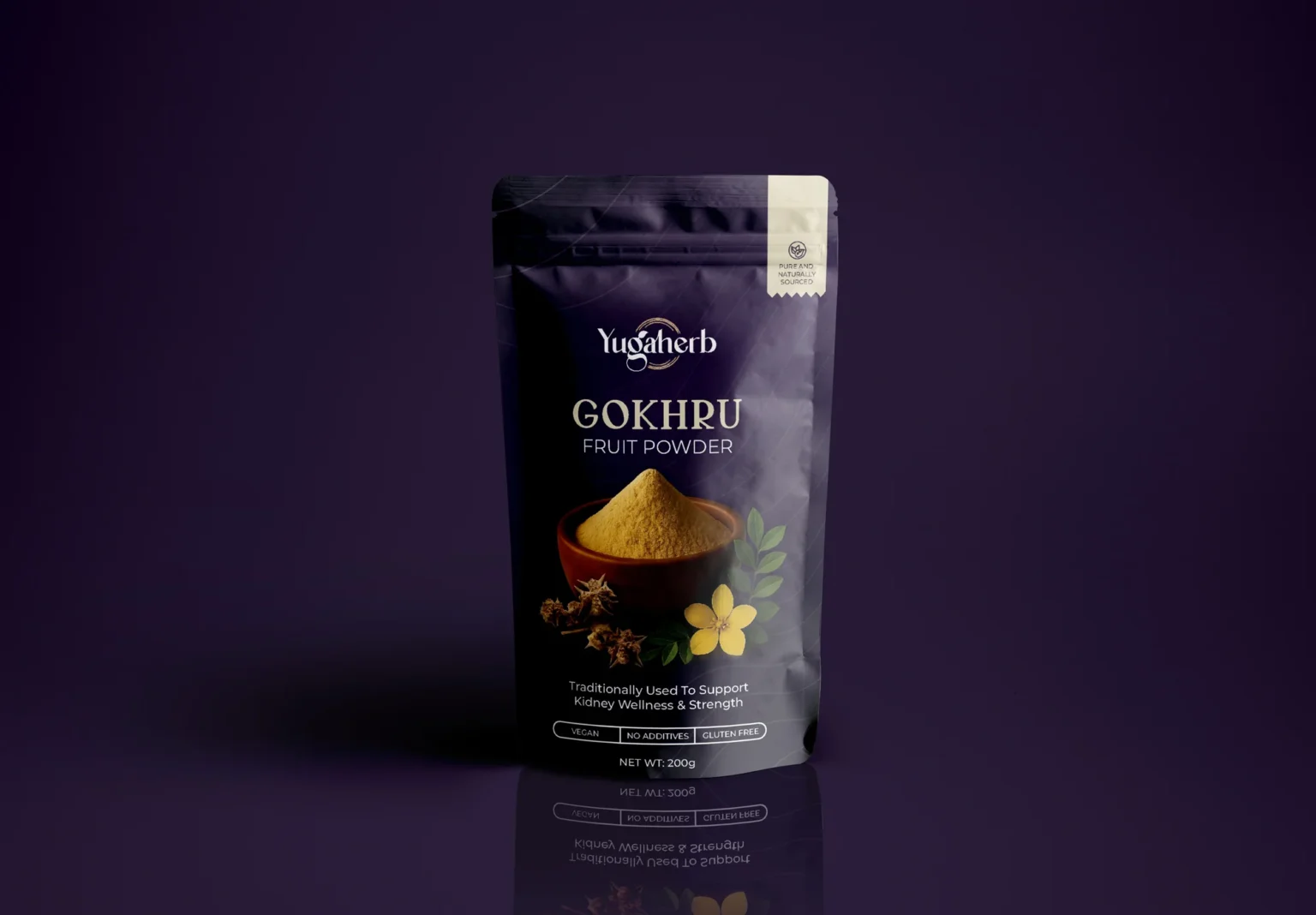
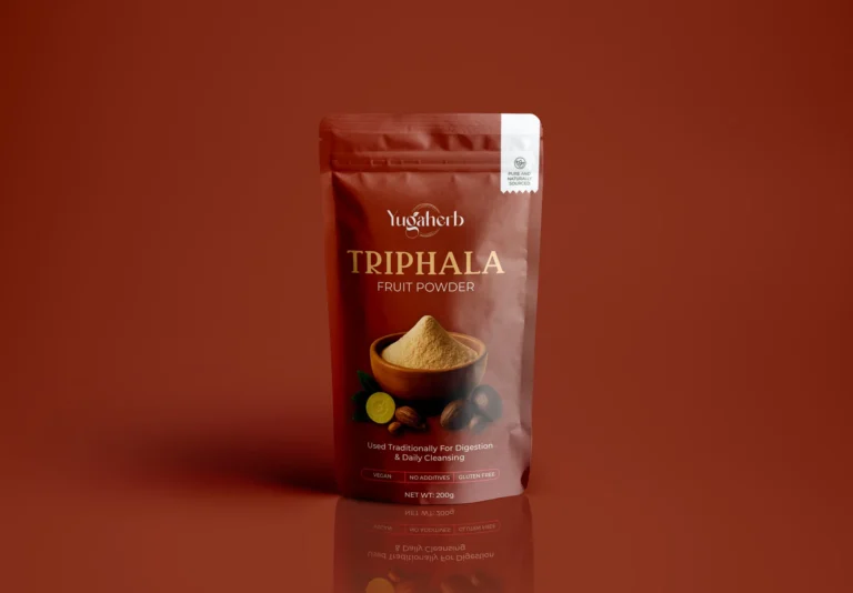
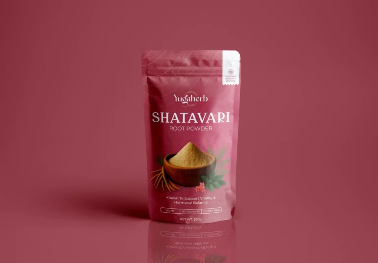
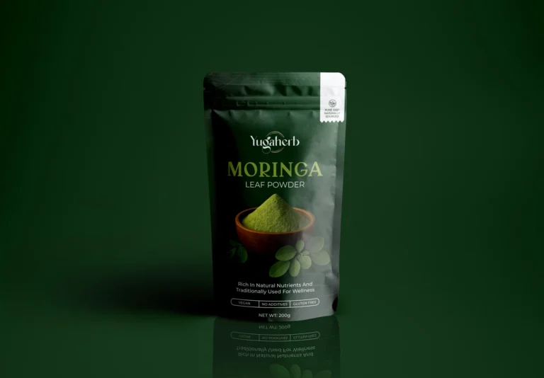
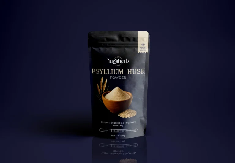
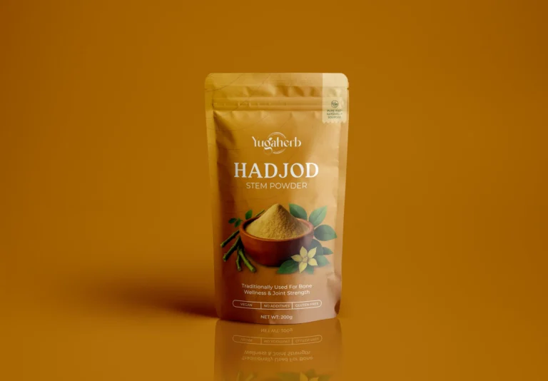
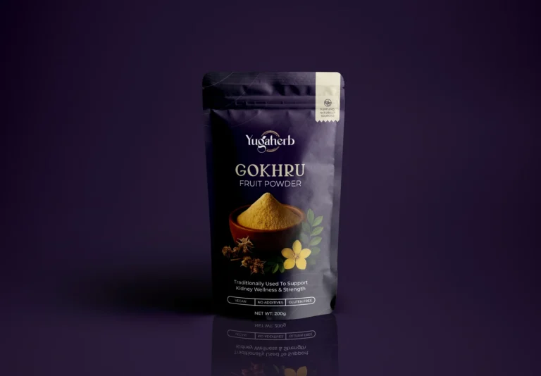
When Yugaherb set out to create a modern Ayurvedic brand that could stand for purity, trust, and presence, we partnered with them from day zero, shaping everything from the brand identity and packaging design to the website experience, ensuring consistency across every touchpoint.

Client
PV Yugaherb Organics LLP
Year
2024
Website
Challenge

How do you take a brand that doesn’t exist yet and make it feel like it’s always been there? Yugaherb came to us with just an idea: premium Ayurvedic supplements. No logo, no website, no packaging. Just a vision of purity, purpose, and presence.

We approached it as a complete brand build. The logo was crafted to carry elegance and a sense of balance, drawing from natural cues without falling into overused Ayurvedic motifs. The packaging design leaned into minimalism and earth tones. Subtle enough to signal trust, bold enough to catch attention.

And the website? Built not just to display products, but to guide users through a brand story that connects authenticity with modern living.

Every touchpoint was designed with intention: clean, clear, and consistent, so that Yugaherb could grow with confidence from day one.

Goal

Turn Ayurveda into a lifestyle people aspire to, not just supplements they consume.

The goal wasn’t just to design packaging or launch a website; it was to position Yugaherb as a modern voice in wellness. We wanted every touchpoint to go beyond product utility and carry a sense of philosophy: Ayurveda as something pure, purposeful, and present in daily life. That meant building a brand that inspires trust, evokes curiosity, and feels relevant to the modern consumer who values both tradition and design-led experiences.

Result

From zero to shelf-ready in one launch.

Yugaherb didn’t just “get a logo,” it walked away with a full brand system that made it look like it had been around for years. The first 5 SKUs rolled out with packaging that actually stood out in the chaos of the supplements aisle, while the website gave the brand a digital face that felt credible from day one.

The real win? Consistency. The same identity stretched cleanly across packaging, digital, and future product lines. No Frankenstein branding, no patchwork fixes. Just a system that scales.

In short: Yugaherb didn’t stumble into the wellness market looking like a newbie. It showed up looking like a contender.

By the numbers:

  • 5 SKUs launched at kickoff
  • 1 cohesive brand system built to scale
  • 0 clichés in sight

Design that doesn’t just package Ayurveda. It makes it present, purposeful, and alive.

Design that doesn’t just package Ayurveda. It makes it present, purposeful, and alive.

Next project
Robotics, but make it fun.